
The 18-Year Cycle
Poppycock or Pattern?


Earlier this week I wrote about why Australia’s housing market might be heading back towards something that looked a lot like the 1990s. Not a crash. Not Armageddon. Just a long period where housing values largely tread water while incomes slowly catch up.
Revisit

In preparing for my annual Master Class workshop last month, I asked attendees to send through questions beforehand so I could better prepare. Several wanted to know about the so-called 18-year housing cycle. More specifically, they asked whether I agreed with the predictions stemming from American businessman Samuel Benner’s famous chart, first published in the 1870s.
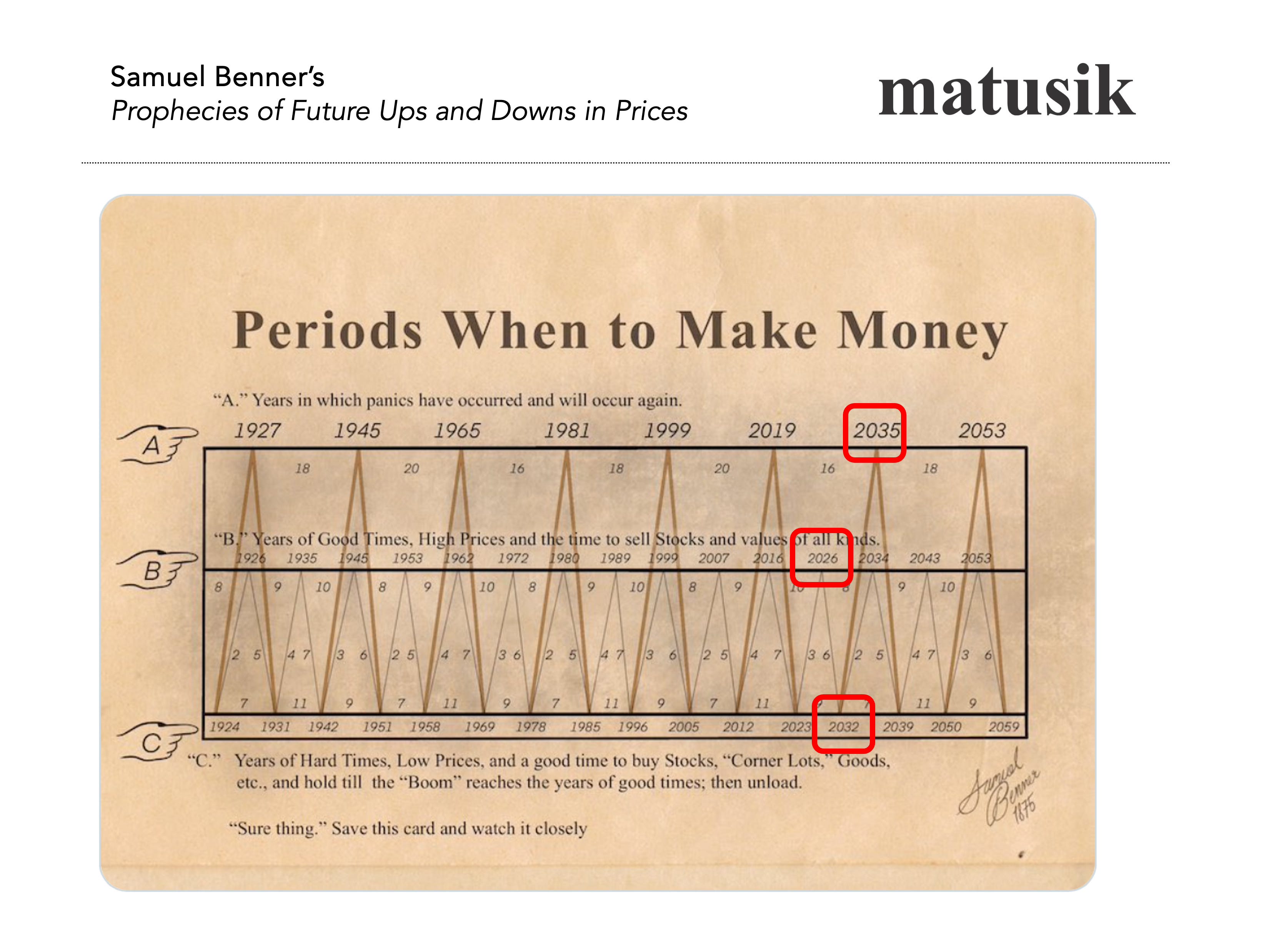
Benner’s chart, reproduced above, attempted to forecast periods of prosperity, panic and recovery using repeating economic cycles. Remarkably, many followers believe it has correctly anticipated major booms and busts for more than 150 years. According to some interpretations, 2026 marks the beginning of another difficult period, with harder economic conditions extending into the early 2030s.
So do I agree? Well, yes and no.
The rest of this post - including my 6 charts outlining how the 18 year cycle applies to Australian housing, including past and current time frames on each stage of the cycle + real life examples - is behind the paywall.